Portfolio List
With this element you can add portfolio list to your page.
Check this demo pages showing different portfolio list style presets available in TheGem:
https://codex-themes.com/thegem/blocks/portfolio-lists/
Note: all this styles can be easily customized to meet your individual design needs. No coding needed.
You can find “Portfolio List” element in editing panel of Elementor in “TheGem Portfolios” group

Content Tab
Layout
Aspect Ratio: with this setting you can select the image aspect ratio to be displayed in portfolio list.
Portfolios
Show: Select to show selected portfolio items or projects, related to the current portfolio page/project. If selecting “Related”, next you need to select the “Related by” taxonomy (in case you have created your own custom taxonomy for portfolio items/projects, it will automatically appear in “Related by” control.
Source: You can show portfolio items from selected portfolio categories and/or manually select portfolio items. To manually select portfolio items simply start typing the names of the respective portfolio items in “Select Portfolio Items” control.
Order By, Sort Order: Specify the sort order of the items in list.
Offset: Here you can displace or pass over the first items in list by specifying the number of such items to pass over.
Exclude: Using exclude control you can exclude portfolio items from being displayed in portfolio list. You can manually specify the items to exclude OR you can exclude the current portfolio page (where you are inserting the portfolio list) OR you can exclude projects by taxonomy term – in this case simply start typing for example the name of the portfolio category, which items should be excluded from being shown.
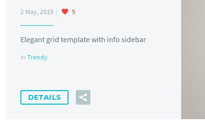
Caption
Caption contains title, description, date and categories of portfolio item. In TheGem portfolio list caption can be shown to the right and to the left of the image, also you can select “zigzag” style or choose to display caption on image hover. Here you can specify the position of caption by selecting it in Caption Position.
Pagination
This section is for selection of pagination type of portfolio list.
Items per page: select, how many portfolio items should be visible in list on one page
Pagination: enable/disable pagination for portfolio list
Pagination Type: select type of pagination.
- Numbers: classic numbered pagination
- Load More Button: additional items will be loaded by clicking on load more button
- Infinite Scroll: additional items will be automatically loaded while scrolling down
In case “Load More Button” type is selected, you can further specify the button text and optionally add some icon to load more button. You can automatically stretch this button to content fullwidth by activating “Stretch to Full Width” or add separator to the left and to the right of the load more button by activating “Separator” control.
Social Sharing
Here you can enable social sharing button to be shown in portfolio item in list as well as select social networks where the item can be shared.
Animations
Here you can enable lazy loading animation of portfolio items in portfolio list and select animation effect in “Animation Effect” select box.
Style Tab
Grid Images Style
In this section you can control gaps between portfolio items in list and style items images.In “Hover” tab you have “Hover Effect” setting with different presets for hover effect, which can be further customized with additional settings
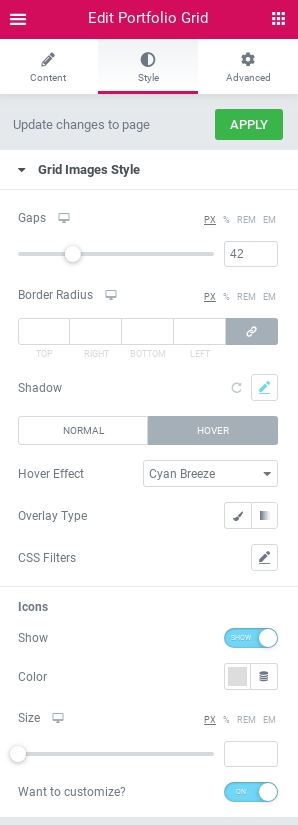
You can also specify, if you wish to show icons on hover, style its color and size. If you wish to use other icons and style each icon separately, use “Want to customize?” control. Once activated, additional section will appear Style tab – “Hover Icons (Custom)”

In this section you can customize each icon separately by choosing the icon from Icon Library, setting its color and rotation.In this section you can also enable shadow. By default, shadow is applied only on image container. By activating “Apply shadow on caption container” setting you can enable a common shadow for image container and caption container.
Caption Style
Here you can customize the style and typography of caption elements: title, description, date etc.
Caption Container Style
Set of settings to customize the appearance of caption container. Note: this section appears only in case if “Caption Position” is set to “right”, “left” or “zigzag” in Content tab – Caption section.
Preset: here you can select between 3 different color presets for caption container, which can be further customized with additional settings.
Details Button Style
Here you can customize the appearance of “Details” button
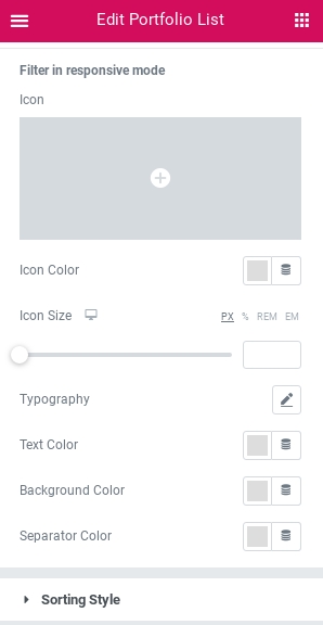
Filter Buttons Style
Settings to control the appearance of filter buttons in portfolio list. This section appears only in case filter buttons have been activated in Content tab – Portfolio section.
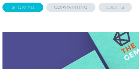
To customize the appearance of filter in responsive mode, use settings in “Filter in responsive mode” group
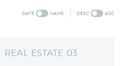
Sorting Style
Settings to customize the appearance of sorting buttons in portfolio grid.
Pagination Style
In this section you can customize the look of number pagination. This section appears only in case if “Numbers” pagination type has been selected in Content tab – Pagination section.
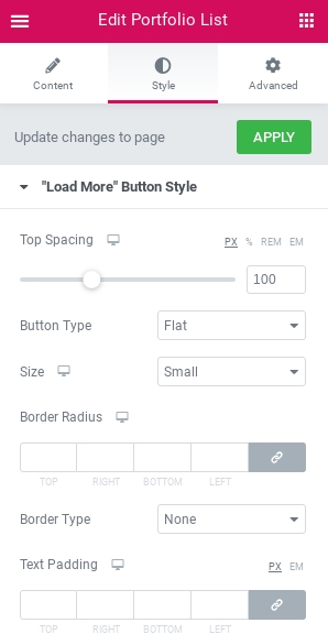
“Load More” Button Style
Here you can customize the look of load more button. This section appears only in case if “Load More Button” pagination type has been selected in Content tab – Pagination section. Here you have presets for button style (flat, outline) and button size and many other additional customization settings. In case you have enabled separator in Content tab – Pagination section, here you can also choose between 4 different style presets and further customize its size, weight and color
Likes Style
Section to customize the look of “like” icon in portfolio grid. You can select any icon from Icon Library, specify its colors and typography for likes number. Note: this section appears only in case if “Caption Position” is set to “Below Image” in Content tab – Caption section.