Portfolio Slider
With this element you can add portfolio slider to your page.
Check this demo page showing different portfolio slider style presets available in TheGem:
https://codex-themes.com/thegem/portfolios/portfolio-sliders-demo/
Note: all this styles can be easily customized to meet your individual design needs. No coding needed.
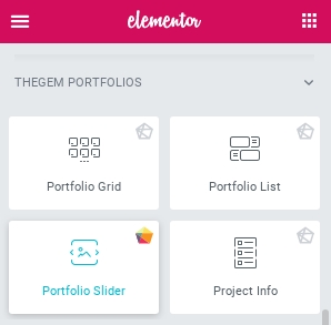
You can find “Portfolio Slider” element in editing panel of Elementor in “TheGem Portfolios” group
Content Tab
Layout
Columns: select number of columns to be displayed in portfolio slider. In case of 100% width selection, portfolio slider will be automatically stretched to the full width of the page. Witn additional option – “100% Width Columns” – you can specify number of columns for screen resolutions greater than 1920px. Please note: 100% width doesn’t appear as 100% width in Elementor edit mode as the element is always limited by section/column’s width settings. However on the front end the gallery grid will take the full 100% width.
Portfolios
In this section you can choose portfolio categories to be displayed and enable or disable displaying of different content elements in each portfolio item in slider.
Caption
Caption contains title, description, date and categories of portfolio item. In TheGem portfolio slider caption can be shown below image, on image or on image hover. Here you can specify the position of caption by selecting it in Caption Position.
Social Sharing
Here you can enable social sharing button to be shown in portfolio item in list as well as select social networks where the item can be shared.
Animations
Here you can specify the sliding animation type and enable lazy loading animation of portfolio items in portfolio slider.
Additional Options
In this section you can enable autoscroll for portfolio slider (and select autoscroll speed). Also you can enable/disable arrows and select icons for left and right arrow from Icon Library.
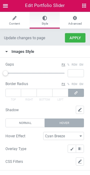
Style Tab
Images Style
In this section you can control gaps between portfolio items in portfolio slider and style items images.In “Hover” tab you have “Hover Effect” setting with different presets for hover effect, which can be further customized with additional settings. You can also specify, if you wish to show icons on hover, style its color and size. If you wish to use other icons and style each icon separately, use “Want to customize?” control. Once activated, additional section will appear Style tab – “Hover Icons (Custom)”
In this section you can customize each icon separately by choosing the icon from Icon Library, setting its color and rotation.In this section you can also enable shadow. By default, shadow is applied only on image container. By activating “Apply shadow on caption container” setting you can enable a common shadow for image container and caption container.
Caption Style
Here you can customize the style and typography of caption elements: title, description, date etc.
Caption Container Style
Set of settings to customize the appearance of caption container. Note: this section appears only in case if “Caption Position” is set to “below image” in Content tab – Caption section.
Preset: here you can select between 3 different color presets for caption container, which can be further customized with additional settings.
Arrows Style
in this section you can style navigation arrows for portfolio slider.
Likes Style
Section to customize the look of “like” icon in portfolio grid. You can select any icon from Icon Library, specify its colors and typography for likes number. Note: this section appears only in case if “Caption Position” is set to “Below Image” in Content tab – Caption section.