Portfolio Grid
With this element you can add portfolio grids to your page. You can learn more about TheGem portfolio in this chapter
Check this demo pages showing different portfolio grid style presets available in TheGem:
https://codex-themes.com/thegem/blocks/category/archives/interior-design/
https://codex-themes.com/thegem/blocks/category/archives/lifestyles/
https://codex-themes.com/thegem/blocks/category/archives/cruise/
https://codex-themes.com/thegem/blocks/category/archives/entertainment/
https://codex-themes.com/thegem/blocks/category/archives/gadgets/
https://codex-themes.com/thegem/blocks/category/archives/lifestyle/
Note: all this styles can be easily customized to meet your individual design needs. No coding needed.
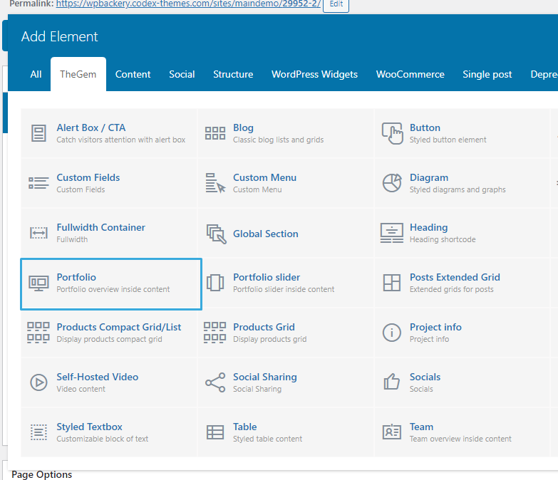
You can find “Portfolio Grid” element in editing panel of WPBakery in “TheGem” group
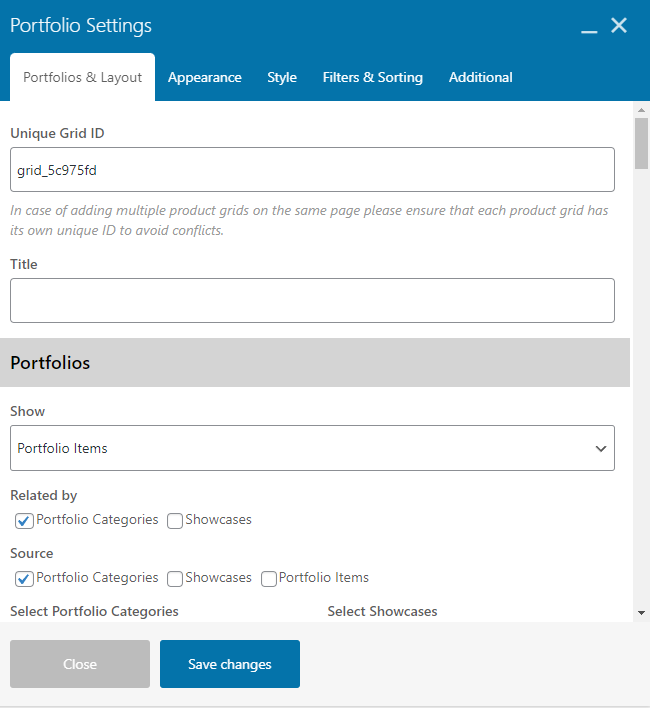
Portfolios & Layout
Grid ID
Specify the unique ID for the grid. Grid ID is used for example for grid filtering via the Grid Filter element.
Portfolios
Show
Select to show selected portfolio items or projects, related to the current portfolio page/project. If selecting “Related”, next you need to select the “Related by” taxonomy (in case you have created your own custom taxonomy for portfolio items/projects, it will automatically appear in “Related by” control.
Source
You can show portfolio items from selected portfolio categories and/or manually select portfolio items. To manually select portfolio items, activate “Portfolio Items” checkbox and simply start typing the names of the respective portfolio items in “Select Portfolio Items” control.
Order By, Sort Order
Specify the sort order of the items in grid.
Offset
Here you can displace or pass over the first items in grid by specifying the number of such items to pass over.
Exclude
Using exclude control you can exclude portfolio items from being displayed in portfolio grid. You can manually specify the items to exclude OR you can exclude the current portfolio page (where you are inserting the portfolio grid) OR you can exclude projects by taxonomy term – in this case simply start typing for example the name of the portfolio category, which items should be excluded from being shown.
Disable Link to Portfolio Page
If you don’t want that clicking on the projects /portfolio items load the respective portfolio page, you can use this setting to disable link to portfolio page
Layout
Layout
Specify layout of portfolio grid. You can choose between grid and creative grid layouts
Columns
select number of columns to display in portfolio grid: for desktop, tablet and mobile. In case of selecting 100% width your portfolio grid will be automatically stretched to the 100% width of the page and you will get an additional option “100% Width Columns” to specify the number of columns for 100% width grid for screen resolutions greater than 1920px. Please note: 100% width doesn’t appear as 100% width in Elementor edit mode as the element is always limited by section/column’s width settings. However on the front end the gallery grid will take the full 100% width.
Style
In case “Grid” is selected as “Layout”, here you can choose the grid style: justified grid, masonry grid or metro style grid.
Image Size
You can choose to display thumbnails, generated by theme for portfolio grids, or original featured images, uploaded in portfolio items (full size)
Image Ratio
With this setting you can specify the custom image aspect ratio to display in portfolio grid. Specify a decimal value, i.e. instead of 3:4, specify 0.75. Use a dot as a decimal separator. Leave blank to show the original image ratio.
Better Thumbnails Quality
This control helps to increase the quality of the generated portfolio item thumbnails – this could be useful in case of using Portfolio Grid in fullwidth sections.
Appearance
Caption
Caption Position
In TheGem portfolio grid caption can be shown below image, on image or on image hover. Here you can specify the position of caption.
Hover Effect
Select between multiple different hover effects. You can then customize the colors in the “Style” tab.
Hover Icons
With this setting you can hide all icons, which appear on image hover, in one click.
Title & Description
Options to show/hide project titles and descriptions in grid.
Meta
Options to show/hide different project meta elements in grid. Using Additional Meta control you can specify to show taxonomy or custom fields on or below the image. “Click behavior” helps to determine, what should happen once the page visitor clicks on this additional meta in grid’s portfolio item.
Project Details
Options to show/hide project details in grid.
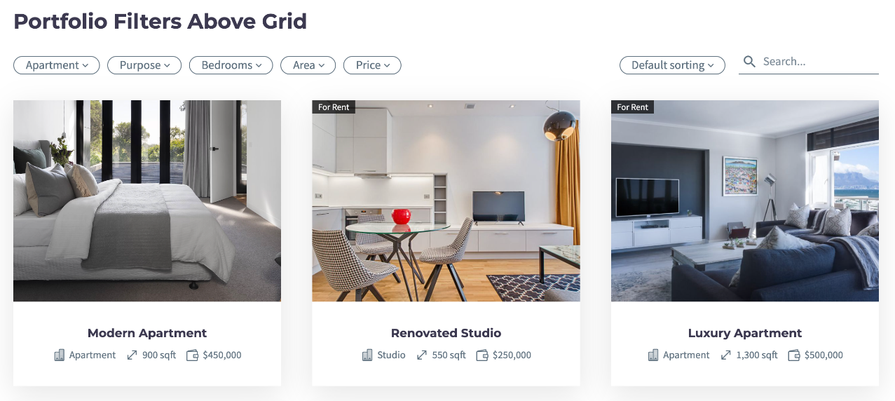
Check this example of using custom fields in grid:
https://codex-themes.com/thegem/blocks/custom-fields-extended-ajax-filter/
You can learn more about custom fields in this chapter .
Following settings are available:
- Fields Layout: Select between vertical or horizontal (inline) layout for displaying custom fields
- Title: Specify the title/label of the custom field
- Type: You can select between TheGem Custom Fields (see description in chapter “Custom Fields” ), ACF/Toolset custom field groups, taxonomies and project details (for portfolio items, see description in chapter “Portfolio”).
- Select Field/Taxonomy: Choose the custom field or taxonomy to be displayed in the item’s caption
- Field Type: Select between “text” and “number” field type. The “number” field type helps to auto-format the number values when displaying in grid using the current WP Locale (see description on chapter “Custom Fields”).
- Prefix/Suffix: Optionally add prefix/suffix to the “number” value
- Icon: Optionally select an icon for the selected project detail/custom field/taxonomy.
Button
Here you can optionally enable the “Read More” button with the respective settings.
Pagination
This section is for selection of pagination type of portfolio grid.
Items per page
select, how many portfolio items should be visible in grid on one page
Pagination
enable/disable pagination for portfolio grid
Pagintaion Type
select type of pagination.
- Numbers: classic numbered pagination
- Load More Button: additional items will be loaded by clicking on load more button
- Infinite Scroll: additional items will be automatically loaded while scrolling down
In case “Load More Button” type is selected, you can further optionally activate the “Show all on load more” setting to load all portfolio items at once after clicking on “Load more” button.
Next page preloading
If enabled, items for the next page will be preloaded on the current page to speed up the paginating.
Reduce HTML Size
Using this option it is possible to reduce the HTML size of the web page by specifying the number of portfolio items to load on initial page load. The rest will be loaded on user scroll.
Example: Let’s say you wish to show 100 items at once on one page. The initial HTML size of the web page will cover all this 100 grid items thus resulting in the large HTML size of the document. However, by activating the “Reduce HTML size” option you can specify, that on the initial page load only 10 grid items should be included – thus significantly reducing the HTML size which increases the performance and page speed.
Style
Grid Image Style
In this section you can control gaps between portfolio items in grid and customize items images.
In Grid Images Style section you can also enable shadow. By default, shadow is applied only on image container. By activating “Apply shadow on caption container” setting you can enable a common shadow for image container and caption container.
Caption Style
Here you can customize the style and typography of caption elements: title, description, date etc.
Project Details
In this section you can customize the appearance of project details in portfolio grid.
Caption Container Style
Settings to customize the appearance of caption container. Note: this section appears only in case if “Caption Position” is set to “Below Image” in Content tab – Caption section.
Preset: here you can select between 4 different color presets for caption container, which can be further customized with additional settings.
Filters & Sorting
Filters
TheGem comes with two types of portfolio filters: default filter and extended filter.
The default AJAX filter allows you to filter the items using the terms of the selected taxonomy (by default: filter by portfolio categories). The default filter comes in three pre-designed filter styles, which can be selected in “Filter & Sorting Style” control. Using the “Query Type” field you can activate the multiple choice filtering by selecting the “AND” option.
Check this example of using default filter in grid:
https://codex-themes.com/thegem/blocks/portfolio-filters-sorting/
Additionally to the default filter, you can take an advantage of the extended filter, which can be selected in “Filter Type” field. Extended filter allows you to add different multiple filter attributes and doesn’t limit it only to one selection as in case of the default filter.
Check this example of using extended filter in grid:
https://codex-themes.com/thegem/blocks/custom-fields-extended-ajax-filter/
Extended filter has three styles you can choose from: horizontal filter, sidebar filter and hidden sidebar filter.
In the “Filters” setting you will find a repeater control for adding multiple different filter attributes. Following settings are available:
Title: Specify the filter’s title
Filter By: Choose between taxonomies, project details, TheGem Custom Fields (see description on chapter “Custom Fields”) and ACF/Toolset custom field groups
Select Field/Taxonomy: Choose the project detail, custom field or taxonomy for filtering
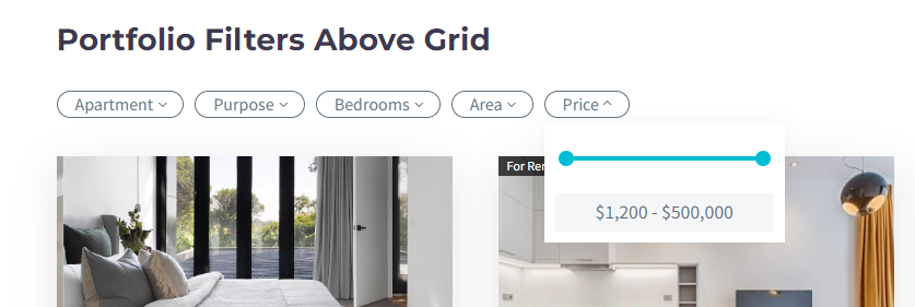
Field Type: Select between “text” and “number” field type. The “number” field type helps you to display slider control (like price range slider) in filter:
Search
Here you can optionally activate the AJAX search in portfolio grid. You can display the search in grid as a search icon or as a search input. You can activate the live search for displaying the search results instantly while typing the search term. And you can select the data source for searching: search by content or search by meta fields (including project details and custom fields).
Additional
This section helps you to make additional adjustments.
Loading Animation
Here you can enable lazy loading animation of portfolio items in portfolio grid and select animation effect in “Animation Effect” select box.
Ignore Highlighted Items
in TheGem you can specify some projects to be emphasized in portfolio grid – this projects will be shown in double size compared to the other projects. You can make it in page options of the respective project/portfolio page with this setting
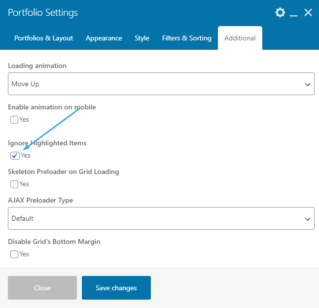
This is a cool way of attracting visitors attention to some project highlights and to make creative grids.By activating “Ignore Highlighted Items” control this project emphasizing will be ignored and all highlighted projects will be displayed as normal projects.
AJAX Preloader Type
You can select between two types of AJAX preloader in grid.